library(geoprofiler)
library(ggplot2)
library(units)
library(sf)
library(dplyr)

theme_set(theme_bw())
options(ggplot2.continuous.colour = "viridis")
options(ggplot2.continuous.fill = "viridis")
Load example data
You can use any spatial data that can be converted into a
sf object. If you have a shape file for example, simply
import it into R using the function
my_data <- sf::read_sf("path/to/my/file.shp")For this tutorial we use the quakes dataset (from R’s
{datasets} package) giving the locations of 1000 seismic
events of MB > 4.0. The events occurred in a cube near Fiji since
1964.
data("quakes")
crs <- st_crs("EPSG:3460") # coordinate reference system for projection
# Convert to sf object and transform to projected coordinates
quakes_sf <- st_as_sf(quakes, coords = c("long", "lat"), crs = "WGS84") |>
st_transform(crs = crs)
quake_map <- ggplot() +
geom_sf(aes(color = depth, size = mag), data = quakes_sf) +
scale_x_continuous(breaks = seq(-360, 360, 5)) +
scale_size_binned()
quake_map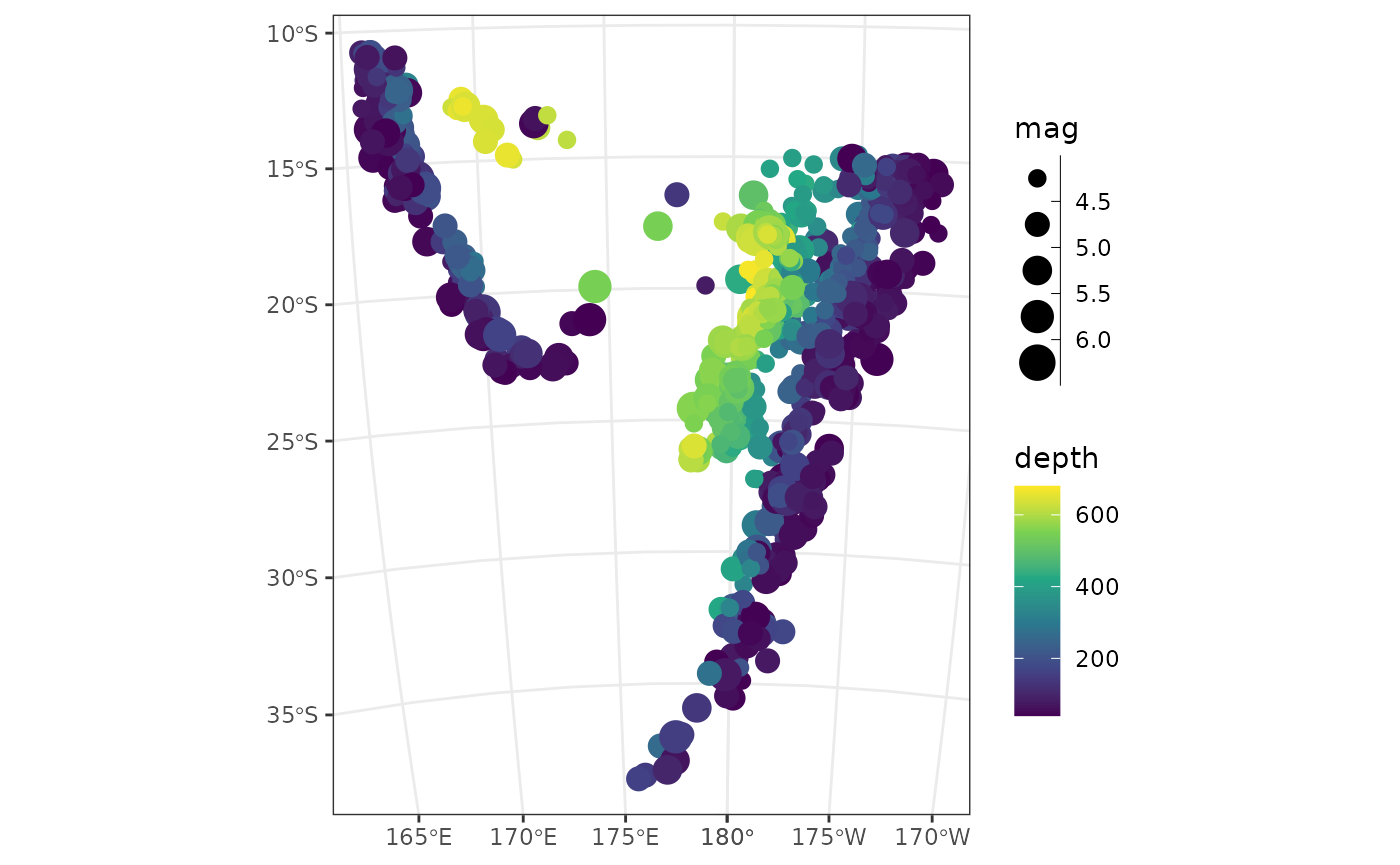 > Transform your dataset into a projected cooridnate reference system
to deal with units such as m, km, miles etc. Otherwise the units will be
in degrees.
Define a profile
There are several ways to define a profile, depending on what is known or what is more relevant.
Profile from two known points
For example, if the profile should be a line connecting two points:
profile_pts <- data.frame(lon = c(160, -170), lat = c(-15, -24)) |>
  st_as_sf(coords = c("lon", "lat"), crs = "WGS84") |> # convert to sf object
  st_transform(crs = crs) # transform to projected coordinates
Combine the two points to a line and add the profile line to the map:
profile_l <- profile_line(profile_pts)

quake_map +
  geom_sf(data = profile_l, lwd = 1)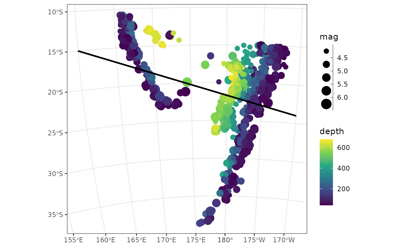
profile_azimuth(profile_l)
#> 112.3832 [°]
profile_length(profile_l)
#> 3336889 [m]
Profile from direction and length from one point
Or, if the orientation of the profile is more relevant, we can define the profile by the direction and distance from one point:
data.frame(lon = 160, lat = 15) |>
  st_as_sf(coords = c("lon", "lat"), crs = "WGS84") |>
  st_transform(crs = crs) |>
  profile_points(profile.azimuth = 112, profile.length = set_units(8000, km))
#> Simple feature collection with 2 features and 0 fields
#> Geometry type: POINT
#> Dimension:     XY
#> Bounding box:  xmin: -48308.26 ymin: 210366.1 xmax: 2948544 ymax: 7627837
#> Projected CRS: Fiji 1986 / Fiji Map Grid
#>                    geometry
#> 1 POINT (-48308.26 7627837)
#> 2  POINT (2948544 210366.1)
Note that the unit of
profile.lengthdepends on the coordinate reference system and must be in degree for lon-lat cooridnates and m (km, miles, …) if otherwise.
Determine the distances along (and across) the profile
To calculate the distances along and across the profile, we simply transform the data into a coordinate system of the profile line:
quakes_profile <- profile_coords(quakes_sf, profile = profile_l) |>
  bind_cols(quakes_sf)
The resulting data-frame gives the distance along the profile
(X) and the distance from the profile (Y).
A quick way to visualize the “transformed” data can be achieved by plotting these axes against each other::
quakes_profile |>
# divide by 1000 for km:
mutate(X = X / 1000, Y = Y / 1000) |>
ggplot(aes(X, Y, color = depth, size = mag)) +
geom_point() +
geom_hline(yintercept = 0, lwd = 1) +
scale_size_binned() +
scale_x_continuous(breaks = seq(0, 3000, 250)) +
scale_y_continuous(breaks = seq(-3000, 3000, 250)) +
coord_fixed()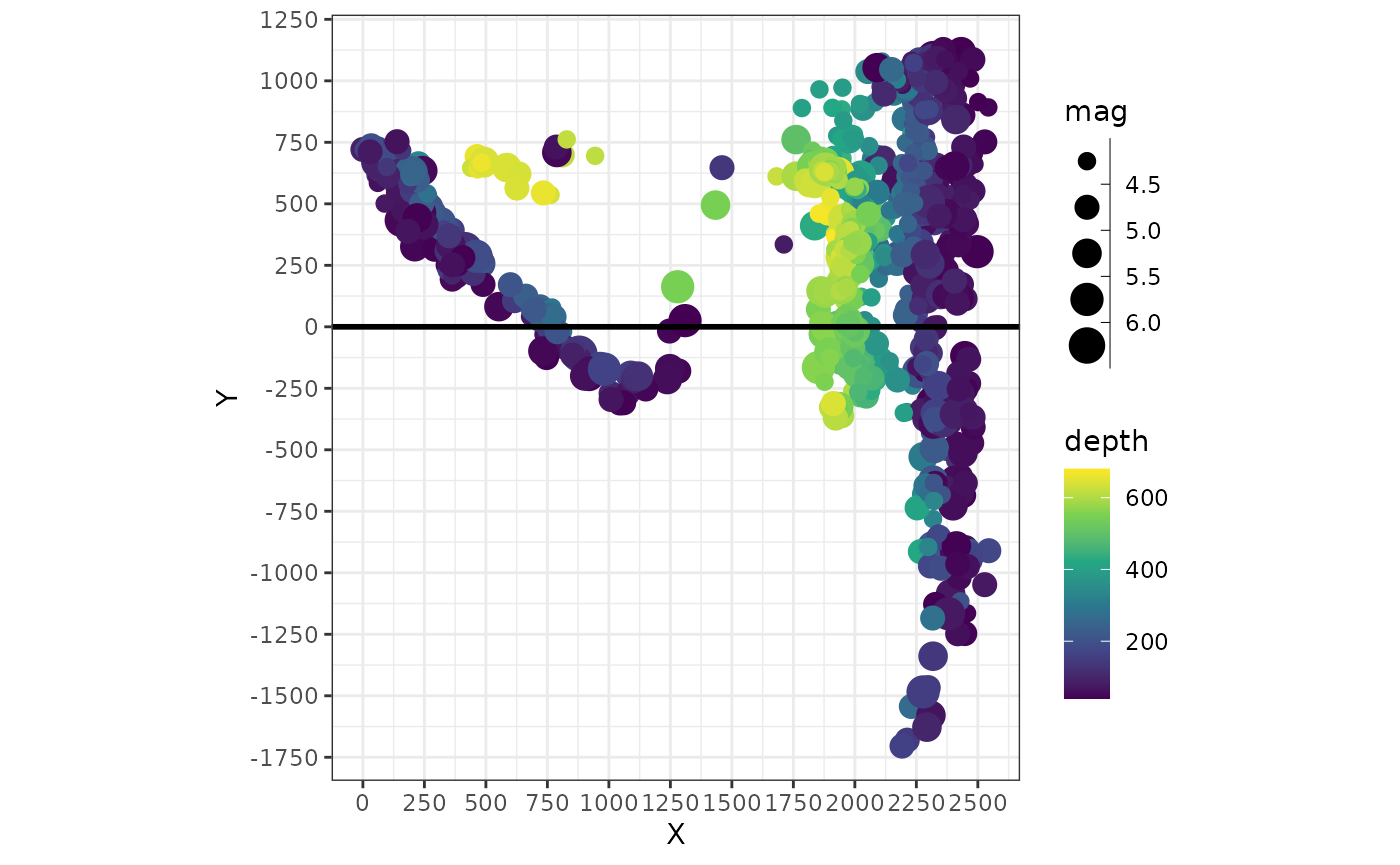 In this plot the profile line is a horizontal line (
X=0)
and the start point of the profile has the coordinates X=0
and Y=0.
Shifting the profile line
The location of the profile line can be easily shifted to the desired
spot by adjusting the X and Y values of the
transformed data.
For example, to shift the profile line more to the “North”, we simply subtract the desired shift (to move it “down”, we would need to add the desired number).
quakes_profile_shifted <- quakes_profile |>
  mutate(
    X = X / 1000, # in km
    Y = (Y / 1000) - 500 # in km and shifted by 500 km to the "North"
  )

ggplot(quakes_profile_shifted, aes(X, Y, color = depth, size = mag)) +
  geom_point() +
  geom_hline(yintercept = 0, lwd = 1) +
  scale_size_binned() +
  scale_x_continuous(breaks = seq(0, 3000, 250)) +
  scale_y_continuous(breaks = seq(-3000, 3000, 250)) +
  coord_fixed()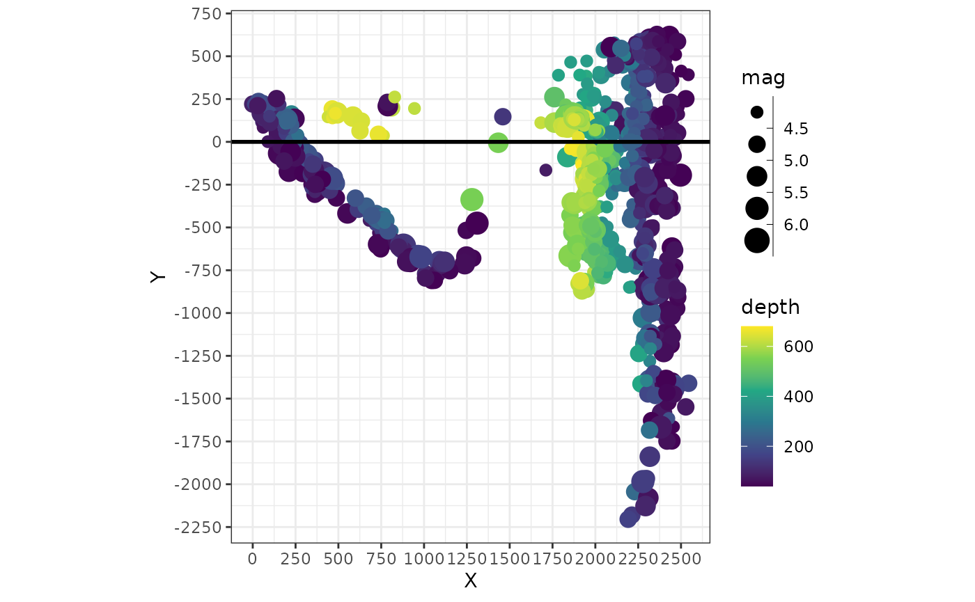
Plot data along profile
Finally, we plot our filtered data against the profile:
ggplot(quakes_profile_filtered, aes(X, depth, color = depth, size = mag)) +
  geom_point() +
  scale_size_binned("Richter Magnitude") +
  scale_y_reverse() +
  scale_x_continuous(guide = guide_axis(position = "top")) +
  labs(x = "Distance along profile (km)", y = "Depth (km)", color = "Depth (km)")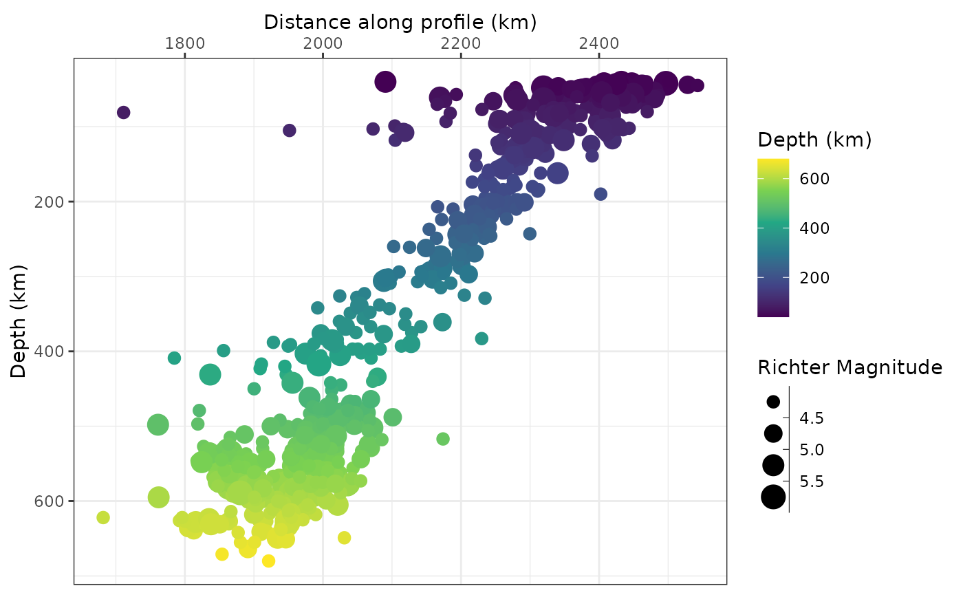
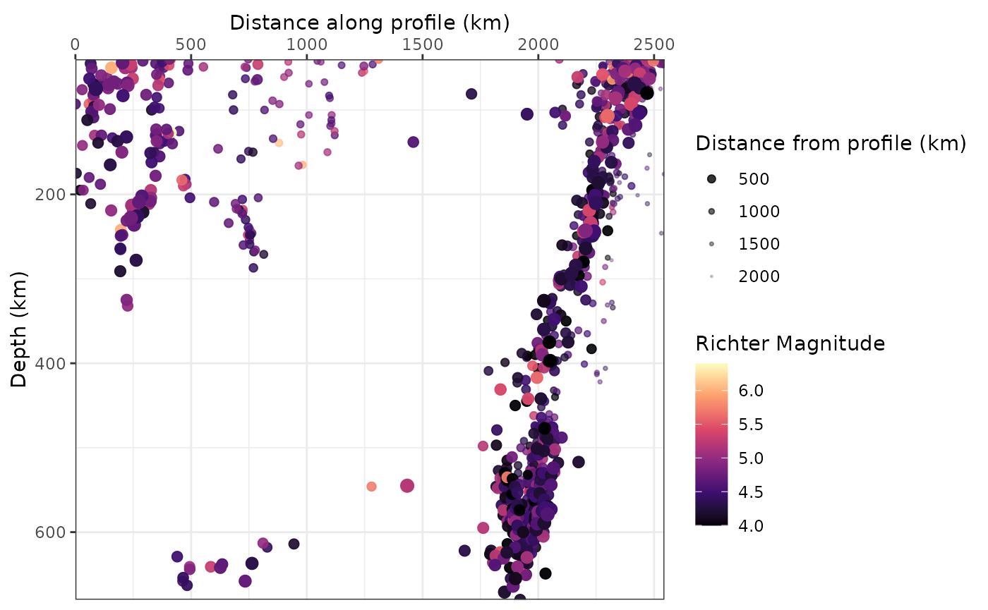
One way to show the distance from the profile in the same plot is by controlling the size (and/or the opacity) of the points. Here I am using the unfiltered data, and show the closest points much larger than the more distant points. This gives a somewhat 3-dimensional look to it:
quakes_profile_shifted |>
  arrange(desc(abs(Y))) |> # sort data to have close datapoints in foreground
  ggplot(aes(X, depth, color = mag, size = abs(Y), alpha = abs(Y))) +
  geom_point() +
  scale_color_viridis_c("Richter Magnitude", option = "A") +
  scale_size_continuous("Distance from profile (km)", range = c(3, .1)) +
  scale_alpha_continuous("Distance from profile (km)", range = c(1, .1)) +
  scale_y_reverse() +
  scale_x_continuous(guide = guide_axis(position = "top")) +
  labs(x = "Distance along profile (km)", y = "Depth (km)") +
  coord_cartesian(expand = FALSE)